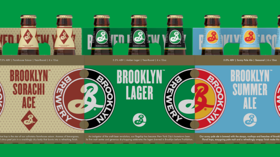
 After 28 years, our friends at Brooklyn Brewery are giving their packaging a little update. Don’t worry, you’ll still be able to pick it out at the packie. In fact – it’ll probably be easier to find.
To get their fresh look, the brewery turned to Milton Glaser who created the original logo back when they launched in 1987. He knows the values of the brand and respects that beautiful B we all know and love. With that in mind, he updated the packaging to create a cohesive and clean look that links all of the brews together on the shelf.
New breweries are popping up every day with crazy logos and labels. The old standbys need to stand out if they want to compete. The best way to do that is by following Brooklyn’s lead with eye-catching color…making great beer doesn’t hurt either.

