 With a new season comes new packaging for brands worldwide. We love when brands change up their label and/or container design for something more visually dynamic; there’s never anything wrong with mixing things up a bit. Still, there have been plenty of bottle makeovers, some of which we believe are more innovative and eye-catching than others. Let’s take a look:
Pernod Ricard:
This fall, Pernod Ricard’s Dead Bolt wine will take on quite the remodeled bottle. Partnering with renowned tattoo artist, David Hale, the company plans to release a new limited edition label design sometime this month (and will be available throughout December). Appearing on Dead Bolt’s 2013 Winemaker’s Red Blend (originating from California), the special packaging marks the brand’s first artistic partnership.
Miller Lite:
As you probably already know, MillerCoors’ Miller Lite has been running a campaign focused around the vintage feel the brew offers its consumers. Because of the promotion’s expanding popularity, the company decided to give a makeover to its classic can by returning to its original 1970’s appearance. Starting this fall, Miller Lite will re-introduce their retro design across all packaging designs and marketing materials. This way, with every sip you’ll be able to reminisce not only about your past, but also about the brand’s history and authenticity.
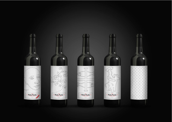
Vino Pinto Punto:
This brand has created an extra-special drinking experience in collaboration with designer, Xisco Barcelo. Each bottle features interactive packaging, where the label in itself is a game of “connect the dots.” Generating images such as fish, flowers, a face, etc., the label design is up to consumers’ participation. While you finish a bottle of Vino Pinto Punto wine, you can have fun by finishing the final look of the label design.
Do you know of other unique packaging designs premiering this season? Tell us about it below!